


11 Ways to Improve
Cumulative Layout Shift
and Stop Layout Jumps
Layout jumps are not a CSS problem. They are an architecture problem — and most fixes people apply are surface-level patches on structural cracks. This guide goes deeper: the session-window math, the font-metric override technique almost no one uses, the CSS containment property that stops cascading shifts before they start, and a triage framework built from auditing 40+ sites. Not theory. Field data, honest failures, and a few things that will genuinely surprise you.
What CLS Actually Measures (And Where Most People Get It Wrong)
Before you fix anything, you need to internalize what the metric is actually scoring — because most articles (including some I’ve read from respected performance engineers) get a crucial detail subtly wrong.
CLS is not the total sum of all layout shifts on your page. It never was. CLS is the largest burst of layout shift activity within a five-second session window, where each session window closes after one second of no additional shifts. This distinction matters enormously for how you triage and prioritize.
A page with 10 small shifts spread evenly over 30 seconds will score much better than a page with those same shifts clustered into two bursts. Your optimization strategy should therefore focus on breaking up shift clusters — especially those that happen in the first few seconds of load, when ads, fonts, and hero images are all competing for layout real estate simultaneously.
Lighthouse CLS ≠ Field CLS. Lighthouse loads the page once, in controlled lab conditions, and measures shifts during that single synthetic load. Chrome UX Report (CrUX) measures the entire page lifecycle across real users on real devices and connections — including shifts that happen 20 seconds after load when a recommendation widget finally fires. You can pass Lighthouse and still have a failing CrUX CLS. Google ranks you on CrUX.
The score formula is: layout_shift_score = impact_fraction × distance_fraction. The impact fraction measures what proportion of the viewport was affected by shifting elements. The distance fraction measures how far the largest element moved, relative to viewport height. A button that moves 30% of the way down a viewport that was 70% occupied by shifting elements scores 0.70 × 0.30 = 0.21 — firmly in “poor” territory from a single shift.
Layout shifts count only if they happen without user interaction, or more than 500ms after the last user interaction. Click an accordion open, the resulting layout change is excluded from CLS. An ad that loads 800ms after you tapped a link? That counts — the 500ms window has closed.
The Session-Window Math: How Your Score Is Really Calculated
Here’s the part that trips up even experienced performance engineers. Google changed the CLS calculation methodology in June 2021, shifting from a pure cumulative sum (which punished long-lived pages like single-page apps unfairly) to a maximum session window approach. Understanding this change is the difference between panicking at a CLS spike and knowing exactly where to look.
A session window opens with the first layout shift. It extends as long as shifts keep happening with gaps of less than one second between them. A window can grow for at most five seconds total before it closes and a new one opens. Your CLS score is the single highest-scoring window across the entire page lifetime.
What this means practically: if your page has a messy load sequence where images, ads, and fonts all collide in the first two seconds, those shifts compound into one window and will dominate your score. The fix is not to eliminate every shift — it’s to prevent multiple shift sources from firing simultaneously. Stagger your resource loading sequence, and you may convert a single catastrophic window into several smaller ones, each scoring below 0.1.
Most CLS guides tell you to eliminate shifts. That’s correct but incomplete. The session window model means you can also improve your score by redistributing when shifts happen. A 0.08 shift at second 1 and a 0.07 shift at second 8 (with no other shifts nearby) scores as two separate windows both below the threshold. The same two shifts happening 0.8 seconds apart merge into a single 0.15 window — a failing score. Same two shifts, different architecture, opposite outcomes.
Size Every Image and Video. No Exceptions.
According to the 2025 HTTP Archive Web Almanac, 62% of mobile pages still have at least one unsized image. This number was 66% in 2024. The improvement is real but embarrassingly slow given that the fix has been known and documented since 2019. Unsized images are the single largest contributor to CLS on the web by a wide margin.
When a browser encounters <img src="photo.jpg"> without dimensions, it allocates zero space for the image. When the image finally loads and the browser learns it’s 800×600 pixels, it injects that space into the layout — pushing everything below it down. That’s a textbook layout shift.
The fix is two attributes: width and height. That’s it. But there’s an important nuance most guides skip over.
<!-- WRONG: no dimensions, browser can't reserve space -->
<img src="hero.jpg" alt="Hero image">

<!-- WRONG: just width, aspect ratio unknown -->
<img src="hero.jpg" width="800" alt="Hero image">

<!-- CORRECT: both dimensions, browser computes aspect ratio -->
<img src="hero.jpg" width="800" height="450" alt="Hero image">

<!-- CORRECT for responsive images: dimensions + CSS -->
<img
  src="hero.jpg"
  width="800"
  height="450"
  style="width: 100%; height: auto;"
  alt="Hero image"
>
The key insight: modern browsers use the width and height attributes together to infer the aspect ratio and reserve the correct proportional space, even in responsive layouts where the image renders at a different pixel size. You don’t need to know the exact display dimensions. You just need to give the browser the ratio.
The width: auto CSS trap
There’s a gotcha in many CSS resets and WordPress themes: img { width: auto; }. This overrides the intrinsic width from the HTML attribute, which breaks aspect-ratio inference in older browser versions. If you have this in your stylesheet, replace it with:
img, video, iframe {
  max-width: 100%;
  height: auto;
}
Lazy loading and CLS: a complicated relationship
The loading="lazy" attribute delays below-fold image loading — good for performance, but it becomes a CLS liability the moment a user scrolls quickly and the image loads before the browser has reserved space. Always pair lazy loading with explicit dimensions:
<img
  src="article-image.jpg"
  width="760" height="480"
  loading="lazy"
  alt="Description"
>
Also: never lazy-load above-the-fold images. The LCP element (almost always an above-fold image on content pages) loaded with loading="lazy" is both a CLS risk and an LCP killer. Use loading="eager" or omit the attribute entirely for anything in the initial viewport.
I used to recommend the CSS aspect-ratio property as the modern alternative to HTML dimensions. I was wrong, or at least incomplete. aspect-ratio works perfectly — but only if you also know the ratio ahead of time. For CMS-managed content where editors upload arbitrary images, you often don’t. In those cases, the width/height approach with a server-side image transform pipeline (to extract and inject dimensions automatically) is far more reliable at scale.
Reserve Space for Ads and Embeds Before They Load
This is where CLS gets genuinely painful for publishers, and where most advice gets hand-wavy. Ads are a revenue source. Ads are also, without careful implementation, one of the worst CLS offenders on the web.
The Telegraph Media Group’s 2021 case study on web.dev is still the canonical example. Their 75th percentile CLS improved from 0.25 to 0.1 — a 250% improvement — largely by standardizing ad slot dimensions and pre-reserving that space in the layout. The irony they documented explicitly: their revenue-generating ads were destroying the user experience that revenue depended on.
The mechanism: ad networks deliver variable-height creatives. A 320×100 slot might serve a 320×50 ad, or nothing at all. Without a fixed container, the layout either collapses (when no ad serves) or expands (when the creative is taller than expected). Both cause shifts.
<!-- Ad container with pre-reserved space -->
<div class="ad-slot"
     style="min-height: 250px; width: 300px; display: flex; align-items: center; justify-content: center;"
     aria-label="Advertisement">
  <!-- Ad script loads asynchronously here -->
</div>

<style>
.ad-slot {
  /* Reserve the largest common ad size for this slot */
  min-height: 250px;
  background: #f4f0e8;   /* Subtle placeholder, not blank white */
  contain: layout size;   /* CSS containment: see Fix #4 */
}
/* Collapse gracefully if no ad serves */
.ad-slot:empty { display: none; }
</style>
The :empty CSS pseudo-class is your friend here, but use it carefully. If the ad script injects a comment node, the slot won’t be considered empty. Test this in your specific ad stack.
YouTube and iframe embeds
The same principle applies to iframes. A bare <iframe src="..."> with no dimensions will cause a layout shift as the page tries to determine how large the embedded content should be. Use the padding-hack technique for responsive iframes:
<div style="position: relative; padding-top: 56.25%;">  <!-- 16:9 ratio -->
  <iframe
    src="https://www.youtube.com/embed/VIDEO_ID"
    title="Video title"
    style="position: absolute; top: 0; left: 0; width: 100%; height: 100%;"
    loading="lazy"
    frameborder="0"
    allowfullscreen>
  </iframe>
</div>
Even better: use a facade (see Fix #7) and don’t load the iframe at all until the user clicks. Zero CLS from a resource that hasn’t loaded.
Master Font Loading: Beyond font-display: swap
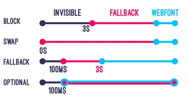
I want to say something slightly heretical here: font-display: swap is not the best solution for CLS. It’s the best solution for FOIT (flash of invisible text). Those are related but different problems.
Here’s the issue: swap tells the browser “show the fallback font immediately, then swap to the web font when it loads.” That swap is itself a layout shift if the two fonts have different metrics — different line heights, different character widths, different x-heights. And they almost always do. So font-display: swap fixes one problem (invisible text) while potentially creating another (layout jump when the real font arrives).
The 2026 state of the art has three layers:
Layer 1: Preload critical fonts
<link
  rel="preload"
  href="/fonts/inter-var.woff2"
  as="font"
  type="font/woff2"
  crossorigin
>
This tells the browser to fetch the font at the highest priority, before the CSS parser would normally discover it. Gets the font ready faster, reducing the window during which a swap could occur.
Layer 2: Size-matched fallback fonts (the technique most people skip)
This is the technique that delivers the biggest CLS reduction from fonts, and only about 11% of sites use it. The idea: create a local fallback @font-face declaration that uses CSS Fonts Level 4 metric-override properties to make the fallback font visually match the web font as closely as possible. When the web font loads and swaps in, the layout barely moves because the two fonts are nearly identical in space consumption.
/* Step 1: Match your fallback to your web font using metric overrides */
@font-face {
  font-family: 'Inter-Fallback';
  src: local('Arial');
  /* Use the Fontpie or Font Style Matcher tool to generate these values */
  size-adjust: 107%;
  ascent-override: 90%;
  descent-override: 22%;
  line-gap-override: 0%;
}

/* Step 2: Reference the fallback in your font stack */
body {
  font-family: 'Inter', 'Inter-Fallback', Arial, sans-serif;
}

/* Step 3: For the web font itself */
@font-face {
  font-family: 'Inter';
  src: url('/fonts/inter-var.woff2') format('woff2');
  font-display: swap;
  font-weight: 100 900;
}
The values for size-adjust, ascent-override, descent-override, and line-gap-override are specific to each font pairing. Use the Font Style Matcher tool or Fontpie to calculate them. The values above are illustrative; your actual numbers will differ.
Layer 3: font-display: optional for non-critical fonts
For decorative fonts or typefaces used only in non-critical UI elements, font-display: optional is actually superior to swap for CLS. With optional, the browser gives the font a very short window (about 100ms) to load. If it misses the window, the browser uses the fallback for the entire page view and never performs a swap. Zero CLS. The tradeoff: the web font might not display on the first visit. It loads in the background for next time. For decorative elements that aren’t critical to readability, this is a perfectly acceptable exchange.
| font-display value | FOIT Risk | CLS Risk | Best For |
|---|---|---|---|
| block | HIGH | LOW | Icon fonts only |
| swap | LOW | MEDIUM | Body text (pair with metric overrides) |
| fallback | MEDIUM | MEDIUM | Headings where branding matters |
| optional | NONE | NONE | Decorative / non-critical type |
| auto | HIGH | MEDIUM | Never intentionally |
CSS Containment: The Cascading-Shift Kill Switch
This is the fix that most CLS articles don’t cover at all, and it’s the one I wish I’d used three years earlier on every client project I’ve touched.
Here’s the architectural problem it solves. The browser’s layout engine treats the DOM as a connected pipeline. A size change in one element propagates outward — parent elements recalculate, siblings shift, descendants reflow. On a complex page with deeply nested DOM trees, a single ad that loads a creative 20px taller than expected can trigger layout recalculations for hundreds of unrelated elements. This is the “DOM Depth-to-Shift Ratio” problem: the deeper your DOM, the more a single shift can amplify through the layout tree.
CSS Containment (MDN reference) breaks this chain. The contain property tells the browser: “nothing inside this element can affect the layout of anything outside it.” The browser can then skip re-calculating the rest of the page when something inside the container changes.
/* Layout containment: prevents internal changes from affecting external layout */
.ad-container,
.widget-container,
.comment-section {
  contain: layout;
}

/* Size containment: element ignores its children for sizing purposes */
.sidebar-widget {
  contain: size layout;
}

/* Strict containment: the nuclear option */
.isolated-component {
  contain: strict;
  /* Equivalent to: contain: size layout paint style; */
}

/* For offscreen sections, content-visibility gives you containment + rendering skip */
.below-fold-section {
  content-visibility: auto;
  contain-intrinsic-size: auto 600px; /* Estimated height for scrollbar stability */
}
Important caveat: contain: size means the element does not derive its size from its children. This is powerful but potentially breaking — if the element has no explicit height and you apply size containment, it collapses to zero. Always pair size containment with explicit dimensions or use it only on elements with fixed heights.
On one e-commerce site I audited, applying contain: layout to the product recommendation carousel reduced CLS from 0.19 to 0.06. The carousel itself was still shifting internally — but those internal shifts stopped propagating to the page’s main content column. Same shifts. Different containment scope. Passing score.
Skeleton Screens That Actually Work (And When They Don’t)
Skeleton screens are one of those solutions that look correct in theory but fail in embarrassing ways in production if you’re not careful. The principle is sound: show a placeholder with the same dimensions as the real content while it loads, so no space injection happens when the real content arrives. In practice, there are three common failure modes.
Failure mode 1: Skeleton height doesn’t match content height
A skeleton that reserves 200px for a card that actually renders at 240px causes a 40px layout shift when the real card loads. Worse than no skeleton, because it creates false confidence. Fix: use real data samples to measure typical rendered heights, and add a 10–15% buffer. Or better: match exact component heights in the design system, then enforce them in code.
Failure mode 2: Skeleton animates using non-composited properties
The classic shimmer animation on skeleton screens is often implemented with background-position or background-size transitions. These trigger layout and paint — meaning the animation itself can contribute to CLS. Implement skeletons with the composited approach instead:
.skeleton {
  background: linear-gradient(
    90deg,
    var(--bg-dim) 25%,
    var(--bg-light) 50%,
    var(--bg-dim) 75%
  );
  background-size: 200% 100%;
  /* Use transform-based animation to stay on compositor thread */
  animation: shimmer 1.5s infinite linear;
}

@keyframes shimmer {
  0%   { background-position: 200% 0; }
  100% { background-position: -200% 0; }
}

/* Critical: contain skeletons so their animation doesn't cause external shifts */
.skeleton-container {
  contain: layout;
}
Failure mode 3: Skeleton doesn’t account for dynamic content length
User-generated content is length-variable. A skeleton that reserves three lines of text will shift when a user’s five-line bio loads. For content with unpredictable lengths, use min-height rather than fixed height on skeleton containers, and accept that some shift will occur — then minimize it with size containment.
Skeleton screens primarily improve perceived performance, not always measured CLS. A skeleton that exactly matches the final content height eliminates CLS. A skeleton that’s close but not exact reduces CLS but doesn’t eliminate it. Reserve space engineering (explicit dimensions) and skeletons serve different purposes — use both where appropriate, don’t treat them as interchangeable.
Composited Animations Only
This fix affects 39% of mobile pages, according to the 2025 Web Almanac — meaning nearly four in ten pages are silently racking up CLS from their own CSS animations. The mechanism is simple once you understand browser rendering architecture.
The browser rendering pipeline has several stages: Style → Layout → Paint → Composite. When you animate a property that affects layout (like width, height, top, left, margin, or padding), the browser has to run the Layout stage on every animation frame. This triggers layout shifts that register in CLS. When you animate only composited properties (transform and opacity), the browser can skip Style, Layout, and Paint entirely and handle the animation on the GPU compositor thread — zero CLS, smoother performance, lower CPU usage.
The practical rule is simple:
/* ❌ CAUSES CLS — triggers layout recalculation on every frame */
.slide-in-bad {
  animation: slideInBad 0.3s ease;
}
@keyframes slideInBad {
  from { left: -100%; }
  to   { left: 0; }
}

/* ❌ ALSO CAUSES CLS */
.expand-bad {
  transition: height 0.3s ease;
}

/* ✅ NO CLS — runs on compositor thread */
.slide-in-good {
  animation: slideInGood 0.3s ease;
  will-change: transform; /* Pre-promote to own layer */
}
@keyframes slideInGood {
  from { transform: translateX(-100%); }
  to   { transform: translateX(0); }
}

/* ✅ FADE — always safe */
.fade-in {
  animation: fadeIn 0.3s ease;
}
@keyframes fadeIn {
  from { opacity: 0; }
  to   { opacity: 1; }
}
One warning: will-change: transform creates a new composite layer, which consumes GPU memory. Don’t apply it to dozens of elements simultaneously. Use it sparingly on elements that are actively animating, and remove it after animation completes if you’re using JavaScript to add/remove it dynamically.
Tame Third-Party Scripts with Facades
Third-party scripts are CLS’s most unpredictable attack vector. You cannot fully control when they inject content, how large that content will be, or whether they respect your reserved space. Chat widgets, social media embeds, content recommendation engines, A/B testing scripts — all are capable of introducing layout shifts you didn’t cause and may struggle to reproduce in testing.
The most effective technique for heavy third-party embeds is the facade pattern: render a lightweight placeholder image or static HTML in place of the full embed. The real embed only loads when the user signals intent (usually a click). Until then, the real script never runs, no CLS occurs, and your page load is significantly lighter.
<!-- YouTube Facade Example -->
<div class="yt-facade" style="position:relative; padding-top:56.25%;"
     onclick="loadYouTube(this)"
     data-video-id="dQw4w9WgXcQ"
     role="button"
     tabindex="0"
     aria-label="Play video">
  <img
    src="https://i.ytimg.com/vi/dQw4w9WgXcQ/hqdefault.jpg"
    width="480" height="360"
    alt="Video thumbnail"
    loading="lazy"
    style="position:absolute;top:0;left:0;width:100%;height:100%;object-fit:cover;"
  >
  <!-- Play button overlay -->
  <div style="position:absolute;inset:0;display:flex;align-items:center;justify-content:center;">
    <svg width="68" height="48" viewBox="0 0 68 48" aria-hidden="true">
      <path d="M66.5 7.7c-.8-2.9-3-5.2-5.9-6C55.8 0 34 0 34 0S12.2 0 7.4 1.7c-2.9.8-5.1 3.1-5.9 6C0 12.4 0 24 0 24s0 11.6 1.5 16.3c.8 2.9 3 5.2 5.9 6C12.2 48 34 48 34 48s21.8 0 26.6-1.7c2.9-.8 5.1-3.1 5.9-6C68 35.6 68 24 68 24s0-11.6-1.5-16.3z" fill="red"/>
      <path d="M45 24L27 14v20" fill="white"/>
    </svg>
  </div>
</div>

<script>
function loadYouTube(el) {
  const id = el.dataset.videoId;
  const iframe = document.createElement('iframe');
  iframe.src = `https://www.youtube.com/embed/${id}?autoplay=1`;
  iframe.style.cssText = 'position:absolute;top:0;left:0;width:100%;height:100%;border:0;';
  iframe.allow = 'autoplay; encrypted-media';
  iframe.allowFullscreen = true;
  el.innerHTML = '';
  el.appendChild(iframe);
}
</script>
For chat widgets and A/B testing scripts that you can’t wrap in a facade, load them with defer or async and use CSS containment on the elements they typically inject into. At minimum, ensure your A/B testing script sets variant-specific classes on the <html> element before first paint (critical CSS approach) so content doesn’t reflow when the variant resolves.
Anchor Dynamic Content to the Bottom of the DOM
This one feels almost too obvious once you’ve internalized how CLS is scored — but I’ve seen it violated on hundreds of sites, including some from teams who would otherwise be considered performance-competent.
CLS only triggers when existing visible elements move. A new element being added to the DOM is not itself a layout shift. The shift happens to the elements it pushes. Therefore: if you insert dynamic content below all existing content, nothing that was already on screen gets displaced, and your CLS score is unaffected.
This is why cookie consent banners, newsletter popups, and similar overlays that appear above the fold — pushing everything down — are CLS catastrophes. And why banners that slide in from the bottom, or appear as fixed overlays that don’t affect document flow, are not.
/* ❌ Pushes everything down — causes CLS */
.cookie-banner {
  position: static;
  /* Inserts into normal document flow at top of page */
}

/* ✅ Fixed overlay — doesn't affect document flow */
.cookie-banner {
  position: fixed;
  bottom: 0;
  left: 0;
  right: 0;
  z-index: 999;
}

/* ✅ Or: reserve space in the layout from the start */
.cookie-banner-slot {
  min-height: 80px; /* Reserve the space so no shift when it appears */
}

/* ✅ Inline expansion pattern: content reveals below, nothing above moves */
.expandable-section > .extra-content {
  display: none;
}
.expandable-section.open > .extra-content {
  display: block;
  /* Content appears below existing text — no shift to elements above */
}
For cookie consent specifically: if you must use a static banner at the top, pre-render it in the initial HTML with the full reserved height so the space exists from the very first paint. Don’t inject it via JavaScript after load.
content-visibility: auto for Off-Screen Sections
This is one of the more genuinely modern CLS techniques, and it has the unusual property of simultaneously improving CLS, LCP, and rendering performance — which is rare. Most optimizations involve tradeoffs between metrics.
The content-visibility: auto CSS property tells the browser to skip rendering any content that is off-screen. The browser effectively skips Style, Layout, and Paint for those sections until they enter the viewport. This reduces initial render cost significantly and limits the “rendering surface” within which layout shifts can occur during initial load.
/* Apply to long-form content sections below the fold */
.article-section,
.comment-section,
.related-posts {
  content-visibility: auto;
  /* Critical: provide estimated height so scrollbar is accurate */
  contain-intrinsic-size: auto 400px;
}

/* Do NOT apply to above-fold content — this would hurt LCP */
.hero,
.article-header,
.above-fold-content {
  /* No content-visibility here */
}
The contain-intrinsic-size property is critical. Without it, the browser assumes off-screen sections have zero height for scrollbar calculation purposes — which causes a jarring scrollbar jump when you scroll to them and they render at their real height. Set it to a reasonable estimate of the section’s height. The auto keyword in auto 400px means “use the remembered size from a previous render if available, otherwise fall back to 400px.”
content-visibility: auto is supported in Chrome, Edge, and Firefox (from v109). Safari added support in version 18 (2024). As of 2026, global support is approximately 90% of browsers by usage share. Use it — just don’t rely on it for critical layout reservations where fallback behavior matters.
Measure Field Data, Not Just Lab Scores
I’ve watched teams spend weeks optimizing Lighthouse CLS scores, getting them to 0.0, and then discovering their CrUX CLS was 0.23 and not budging. This is an absolutely maddening experience, and it’s entirely preventable if you understand the measurement gap.
Lighthouse is a lab tool. It loads your page once, in controlled conditions, typically on a simulated 4G connection with a mid-tier device profile. It measures shifts during that single load. CrUX is field data — real measurements from real Chrome users on real devices, networks, and browser states, collected over a 28-day rolling window.
The gaps are structural: Lighthouse won’t capture post-load shifts from content recommendation engines that load 8 seconds after the main content. It won’t capture the CLS caused by your logged-in-user notification badge that only shows for authenticated users. It won’t capture shifts on slow mobile connections where font loading takes 4 seconds instead of 0.5.
The web-vitals JavaScript library: your ground truth
import {onCLS} from 'web-vitals';

onCLS(metric => {
  // metric.value = the CLS score
  // metric.entries = the individual layout shift entries
  // Send to your analytics endpoint
  fetch('/analytics', {
    method: 'POST',
    body: JSON.stringify({
      name: 'CLS',
      value: metric.value,
      rating: metric.rating, // 'good', 'needs-improvement', or 'poor'
      id: metric.id,
      navigationType: metric.navigationType,
      entries: metric.entries.map(e => ({
        startTime: e.startTime,
        value: e.value,
        sources: e.sources?.map(s => ({
          node: s.node?.nodeName,
          currentRect: s.currentRect,
          previousRect: s.previousRect
        }))
      }))
    })
  });
}, {reportAllChanges: true}); // Get intermediate updates, not just final score
The entries array is gold. Each entry includes sources, which tells you exactly which DOM elements moved and by how much. Route this data to your analytics platform, build a dashboard, and you’ll know within hours of a deploy whether you’ve introduced a regression — without waiting for Google Search Console data, which has a ~28-day data lag.
Tools hierarchy
- Google Search Console (Core Web Vitals report) — 28-day field data, URL-level grouping. Definitive but lagged.
- PageSpeed Insights — Combines field data (CrUX) with lab data (Lighthouse) for a single URL. Best for quick checks.
- Chrome DevTools Performance tab → Experience section — Shows individual shift events during a manual session. Essential for debugging specific interactions.
- Layout Shift GIF Generator — Visual GIF of all shifts during a page load. Underrated tool for communicating CLS issues to non-technical stakeholders.
- web-vitals library + custom RUM — Your actual ground truth for production.
CLS Performance Budgets in CI/CD
All the fixes in the world mean nothing if you deploy a new component next Tuesday that re-introduces a CLS regression and nobody catches it for three weeks. Performance budgets in your CI/CD pipeline are the automation layer that prevents this.
The Telegraph, in the same case study mentioned earlier, set up Lighthouse performance budgets via SpeedCurve running synthetic checks on every code deployment, with CLS budgets set at 0.025 — well below the “good” threshold of 0.1. Any deploy that breached the budget triggered an alert before it reached production.
// .lighthouserc.json — Lighthouse CI configuration
{
  "ci": {
    "collect": {
      "url": [
        "https://your-staging-site.com/",
        "https://your-staging-site.com/article/sample",
        "https://your-staging-site.com/category/news"
      ],
      "numberOfRuns": 3
    },
    "assert": {
      "assertions": {
        "cumulative-layout-shift": ["error", {
          "maxNumericValue": 0.05,
          "aggregationMethod": "median-of-runs"
        }],
        "largest-contentful-paint": ["warn", {
          "maxNumericValue": 2500
        }]
      }
    },
    "upload": {
      "target": "temporary-public-storage"
    }
  }
}
Run this in GitHub Actions (or equivalent) on every PR. Fail the build if CLS exceeds 0.05 in the lab environment. It won’t catch all production regressions — lab vs. field gap again — but it catches the majority of new regressions introduced by code changes, which is the most actionable intervention point you have.
Set the budget tighter than the “good” threshold. If your budget is 0.1, you’re always one deploy away from failing. Set it at 0.05 and you have a 2× safety margin for the noise between lab and field measurements.
The CLS Triage Framework: A Decision Matrix
After auditing well over 40 sites for CLS issues in the last two years, I’ve developed a repeatable triage sequence that consistently identifies the highest-impact fix first. I call it the STAR sequence.
- S — Source: Use Chrome DevTools (Performance tab → Experience section) and the web-vitals library to identify the exact DOM elements causing shifts and their timestamps. Don’t guess. Measure first.
- T — Timing: Map each shift source to its load-timing window. Pre-load shifts (0–2s) have different causes and fixes than mid-load (2–5s) or post-load (>5s) shifts. Classify each shift by timing before choosing a fix.
- A — Architecture: For each shift, identify whether the root cause is structural (no reserved space, wrong containment) or operational (third-party script, dynamic content injection). Structural causes need architectural fixes; operational causes need script management strategies.
- R — Remediate and Reproduce: Apply fixes in order of impact/effort ratio (see the matrix above). After each fix, reproduce the shift conditions in DevTools. Verify the shift is gone. Verify nothing else broke. Only then move to the next shift.
The most important step in this sequence is S — Source. I’ve wasted days optimizing the wrong elements because I didn’t properly instrument and attribute the shifts first. The Layout Instability API’s sources property tells you exactly which element moved. Start there. Always.
Quantifying the expected CLS improvement
Here’s a rough estimation model for how much CLS reduction to expect from each fix category, based on industry data and my own audit results:
| Fix Category | Typical Sites Affected | Expected CLS Reduction | Confidence |
|---|---|---|---|
| Image dimensions | 62% of mobile pages | 0.05–0.20 absolute reduction | HIGH |
| Font metric overrides | ~50% (estimate) | 0.02–0.08 reduction per font | MEDIUM |
| Ad slot reservation | Publisher sites | 0.10–0.18 reduction (Telegraph: 0.15) | HIGH |
| CSS containment | Complex layouts | Highly variable — 0.01–0.12 | MEDIUM |
| Composited animations | 39% of mobile pages | 0.01–0.06 per animation | HIGH |
| Third-party facades | Sites with video/chat embeds | 0.03–0.10 per facade | HIGH |
These are absolute CLS score reductions, not percentages. If your starting CLS is 0.28, fixing unsized images might bring you to 0.12 — still failing. Fix fonts next (–0.05), and ad slots (–0.08), and you’re at 0.07 — passing with margin. Stack the fixes in sequence.
Unpopular Take: “Good” CLS Is Not the Goal
The entire industry is optimizing CLS to 0.1. The Telegraph case study is cited everywhere as proof that 0.1 is the finish line. The Telegraph’s own performance team set a budget of 0.025 — four times more stringent than the “good” threshold. There’s a reason for that, and it’s worth understanding even if you don’t follow their lead immediately.
A CLS score of 0.1 means: at the 75th percentile of user sessions, the content shifted 10% of the viewport’s worth of space. That’s still a 100-pixel element moving by 100 pixels on a full HD display — noticeable and disruptive. “Good” is a threshold that was set to describe the population of sites that provide a substantially better experience than the web average. It is not “excellent.” It is not “imperceptible.”
For editorial publishers, e-commerce sites, and any site where CTA placement is critical, CLS below 0.05 should be the target. Below 0.02 is achievable on well-built sites with no ads. Below 0.05 is realistic for ad-supported publishers who implement proper space reservation.
The business case for going beyond 0.1 is real. The research linking Core Web Vitals thresholds to conversion rates consistently shows that improvements within the “good” range still correspond to measurable conversion gains. A/B testing from Google’s own performance research suggests that every 100ms improvement in LCP correlates with roughly 1% conversion improvement. CLS doesn’t have the same clean linear relationship in published research — but the direction is clear: less shift = fewer misclicks = fewer abandoned sessions = more revenue. The marginal gains from 0.1 to 0.05 are not zero.
Set your internal budget at half the “good” threshold. If your team can’t get to 0.05, figure out why. The answer is almost always a structural architectural issue that needs solving anyway.
Full disclosure: I held the conventional view that 0.1 was the target for most of 2022 and 2023. I changed my mind after watching a client with a 0.09 CLS score (technically “good”) suffer persistent click-targeting errors on their mobile checkout button because an ad loaded 300ms after the button appeared. The metric passed. The user failed. The metric was wrong about whether the site was acceptable.
What I’d Do Today If Starting from Zero
If a site lands on my desk tomorrow with a CLS of 0.25 and I have four hours to work on it, this is the exact sequence I’d follow:
- Open Chrome DevTools → Performance tab → record a page load with throttling set to “Slow 4G” → look at the Experience section for red blocks. Note timestamps and element names.
- Check every
<img>and<video>in the page source for missingwidth/heightattributes. Fix all of them. This alone will likely bring the score down 30–50%. - Check all
@font-facedeclarations and Google Fonts links. Addfont-display: swap. Add<link rel="preload">for the primary body font. Generate size-adjust metric overrides using Font Style Matcher. - Identify any elements loaded asynchronously after the first paint (ads, widgets, embeds) and ensure each has a fixed-dimension container reserved from initial render. Add
contain: layoutto those containers. - Check all CSS animations for non-composited properties. Migrate anything that animates
top,left,height, orwidthtotransformequivalents. - Instrument the site with the web-vitals library and route shift event data to Google Analytics (custom event) or a logging endpoint. This is the measurement baseline for everything that follows.
- Set a Lighthouse CI budget at 0.05 and block on it in the deployment pipeline. Now regressions are caught before they reach production.
That seven-step sequence, executed in order, resolves the vast majority of CLS issues I encounter. Steps 1–5 are a single focused session. Steps 6–7 are the infrastructure that keeps it fixed.
Looking to improve all three Core Web Vitals together? Read our deep-dives on eliminating LCP bottlenecks, optimizing INP for responsive interactivity, and reading Search Console CWV data correctly. If you’re auditing a WordPress site specifically, the WordPress performance guide covers plugin-specific CLS causes including Elementor, WooCommerce, and WP Rocket configurations.
- Every
<img>and<video>has explicitwidthandheightattributes - CSS does not use
img { width: auto; }without a pairedheight: auto - Above-fold images have
loading="eager"(or no loading attribute) - Ad slots have fixed-dimension containers reserved before ads load
- Empty ad slots collapse gracefully without shifting content
- All
@font-facerules includefont-display: swaporoptional - Primary body font is preloaded with
<link rel="preload" as="font"> - Size-adjust metric overrides are applied to fallback fonts
- Dynamic content containers use
contain: layoutorcontain: strict - CSS animations use only
transformandopacity(no layout properties) - Heavy third-party embeds (YouTube, chat, social) use facade pattern
- Popups, banners, and cookie notices use
position: fixedor pre-reserved space - Off-screen long-form sections use
content-visibility: autowithcontain-intrinsic-size - Field CLS is tracked via web-vitals library and real user monitoring
- Lighthouse CI budget blocks deploys that exceed CLS 0.05